Me
Direction, brand system, page structure, prompt writing, design decisions, review and QA
Web Design · AI-assisted Concept
A concept redesign of the website for Visible One, a Hong Kong digital agency founded in 2008 — reimagined as a bold, dark, honey-toned brand experience that shows the agency’s credibility instead of just listing services.
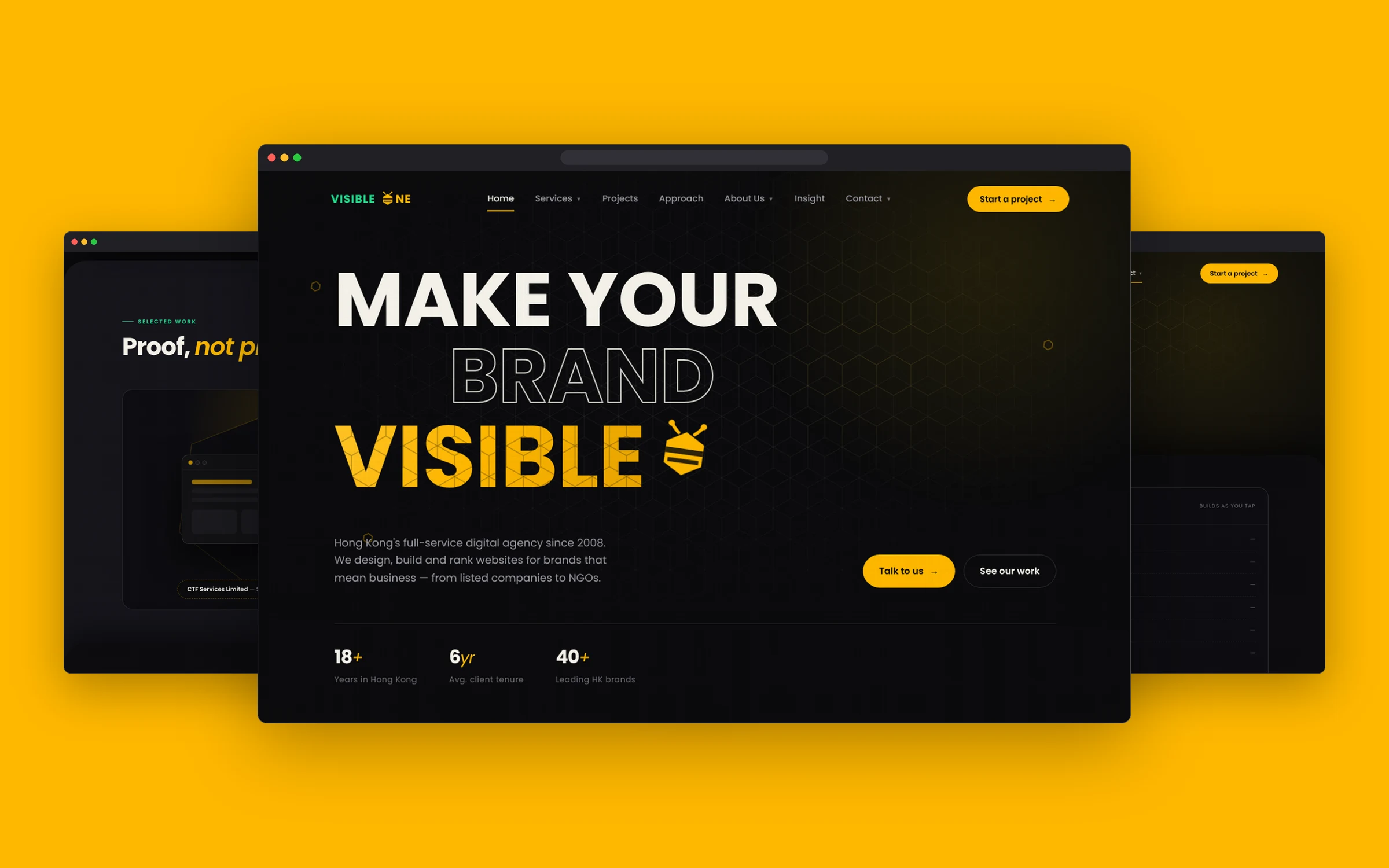
Visible One has a track record of work for well-known Hong Kong brands, from listed companies to universities and NGOs. I explored how its website could feel as confident as that track record: a distinctive brand language built around the “bee” in the logo, a clear story from services to proof to process, and a quote flow that removes friction.
Designed in the browser, not in Figma — built entirely by directing Claude through prompts.
A full-service agency offers a lot — web, e-commerce, SEO, cloud, hosting, even phone systems. The risk is a site that reads like a long service list. The challenge was to make a wide offer feel focused, make past work feel like proof, and give busy decision-makers a fast path to start a project.
Marketing and IT leads at Hong Kong companies, institutions and NGOs who need a long-term web partner — people comparing agencies quickly and looking for evidence, process and a clear next step.
This concept was my test of an AI-first design process. Instead of drawing screens in Figma and handing them off, I worked directly with Claude: I set the direction, wrote the briefs and judged every result — Claude handled research support, copy drafts and code. The site was shaped through rounds of prompt, review and refine in the browser.
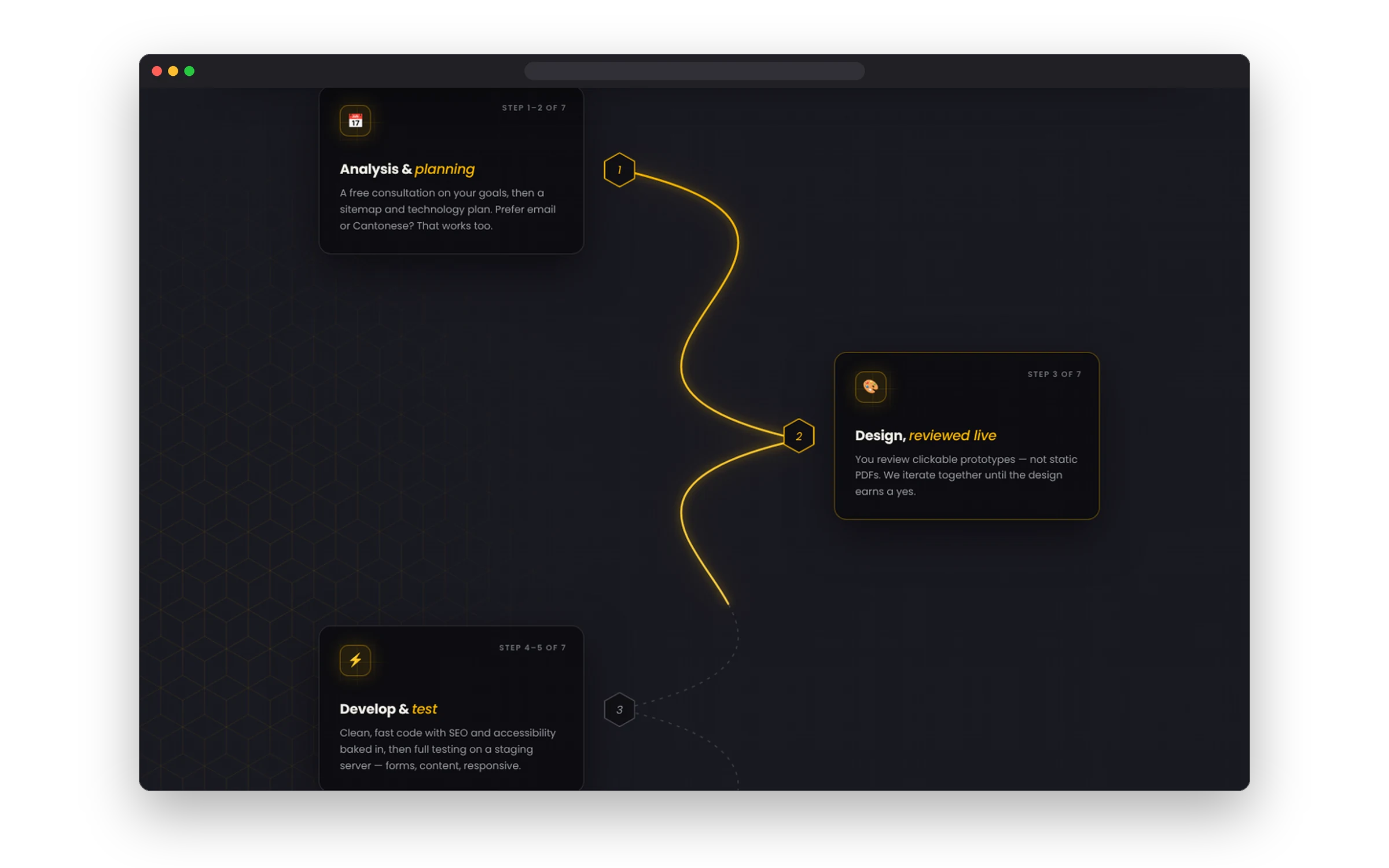
Used Claude to review Visible One's services and past work, then shaped them into a clear sitemap and page story.
Defined the brand system myself (honey yellow, hexagon textures, the bee mark, dark UI) and turned it into a written design brief for Claude.
Claude generated each page's HTML, CSS and interactions from the brief. No mockups — the design lived in the browser from day one.
Checked every page in the browser and gave specific visual feedback on hierarchy, spacing, motion and copy. Many rounds until each section felt right.
Tested responsive layouts and accessibility, fixed issues, and deployed the prototype to Vercel.
Direction, brand system, page structure, prompt writing, design decisions, review and QA
Research support, copy drafts, HTML/CSS/JS code, quick variations to compare
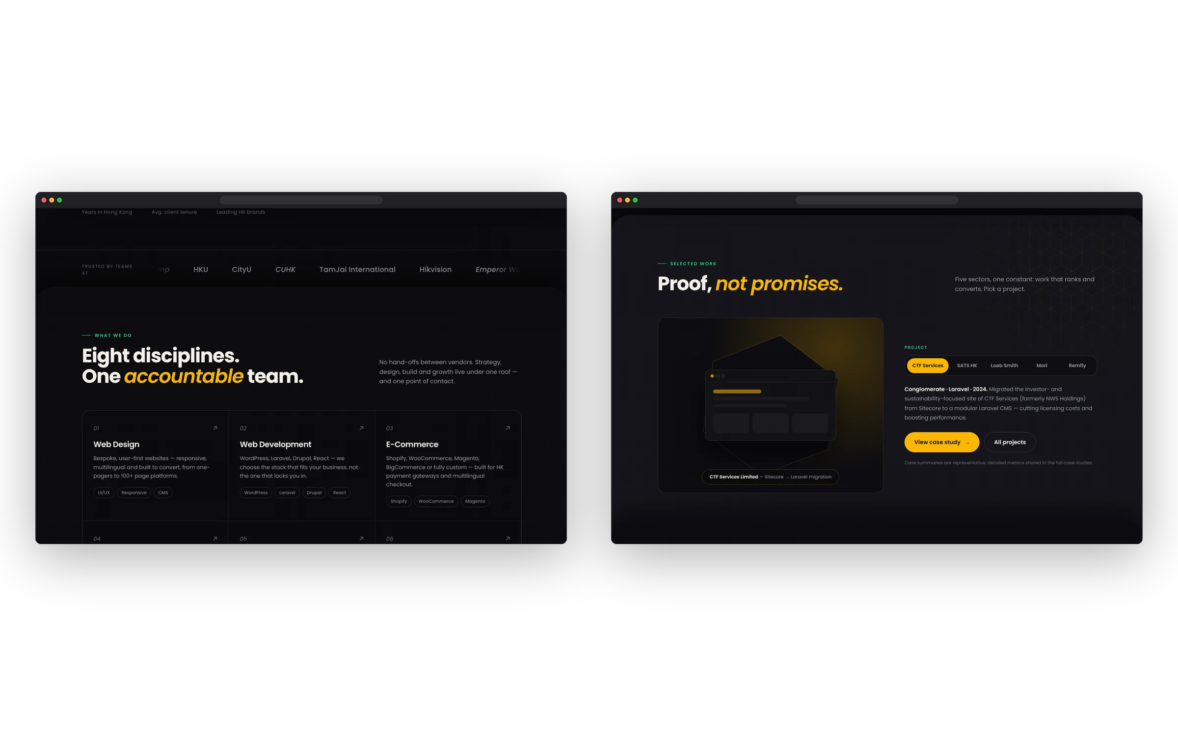
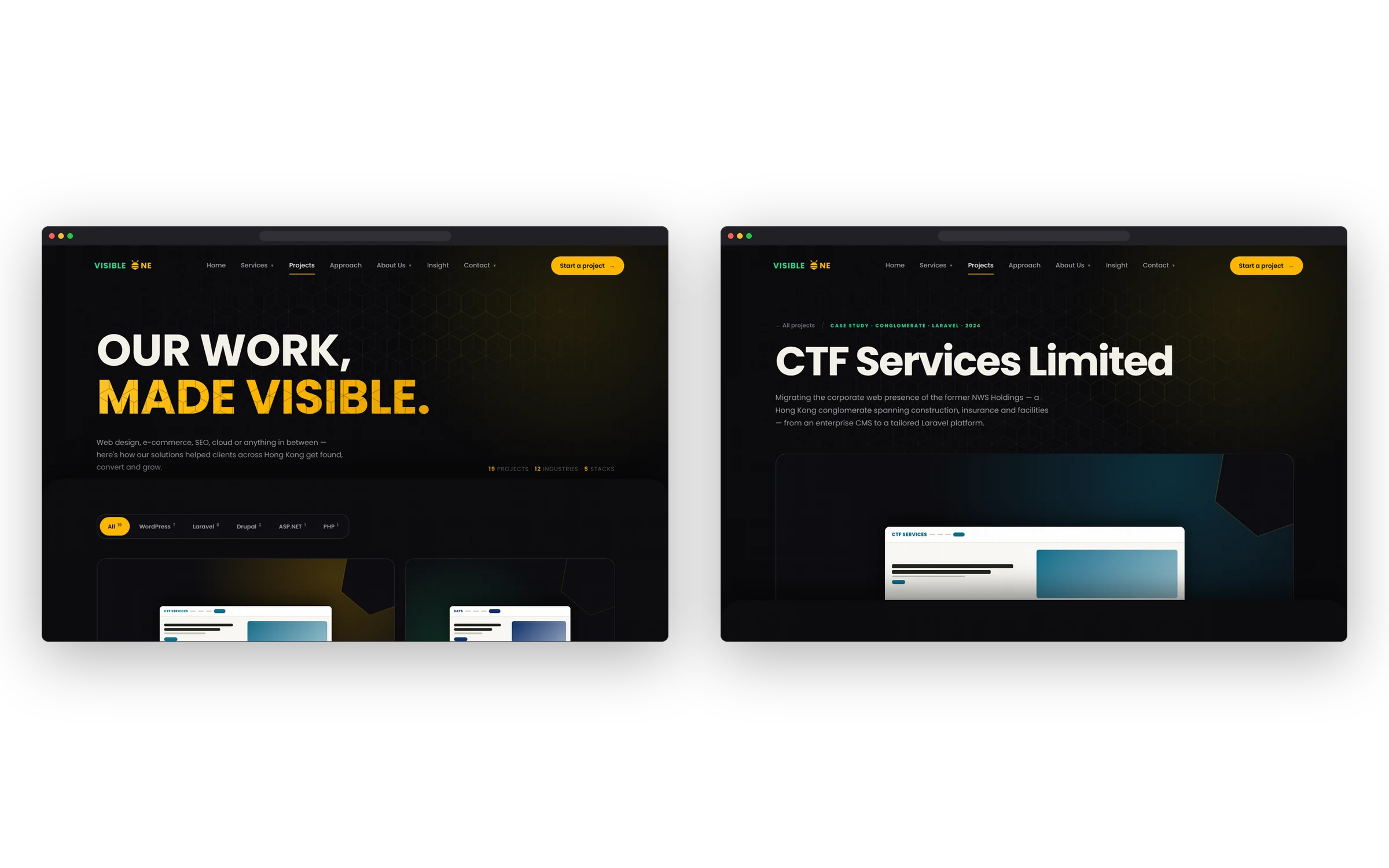
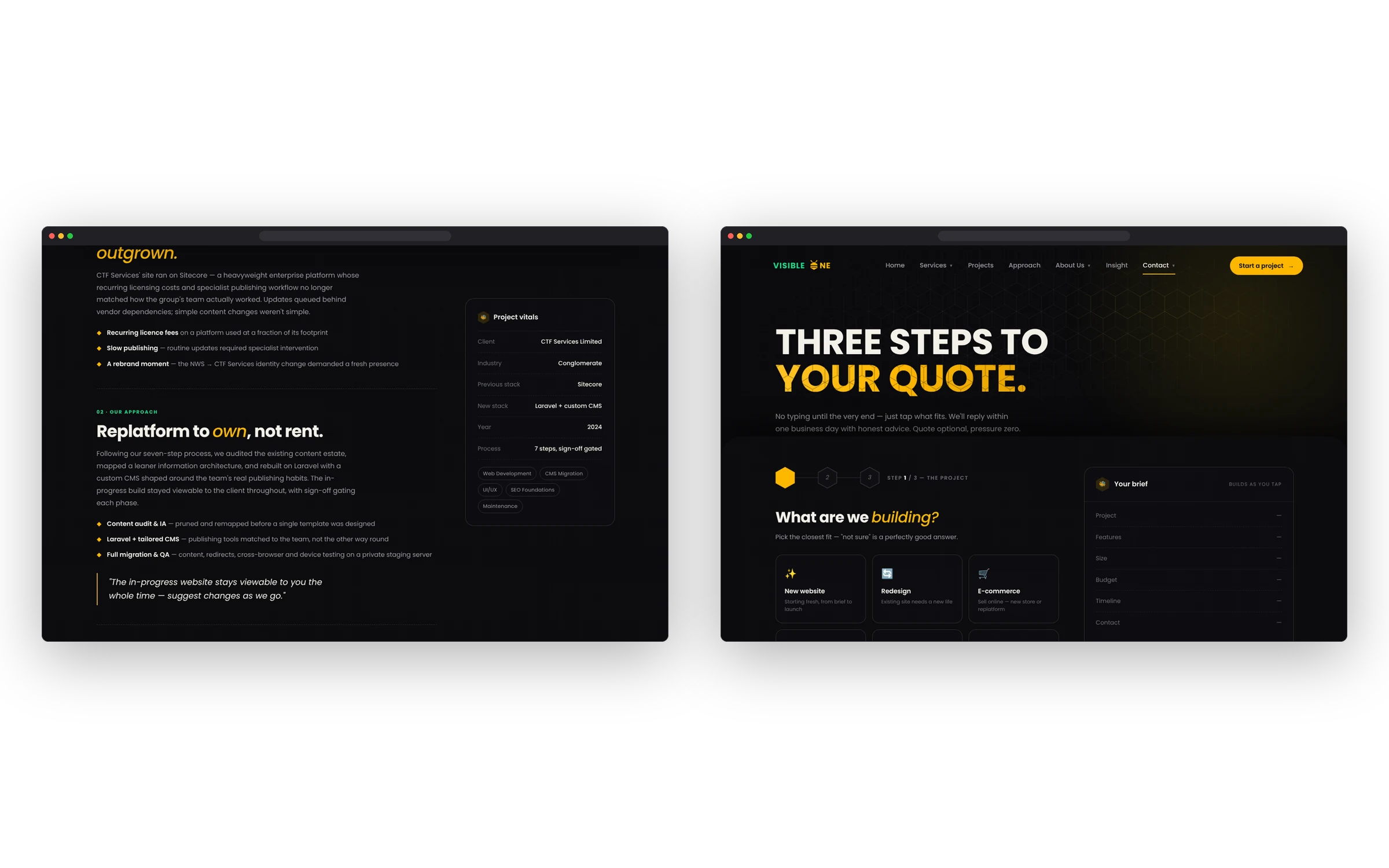
Drag or swipe to explore · Arrow keys to browse
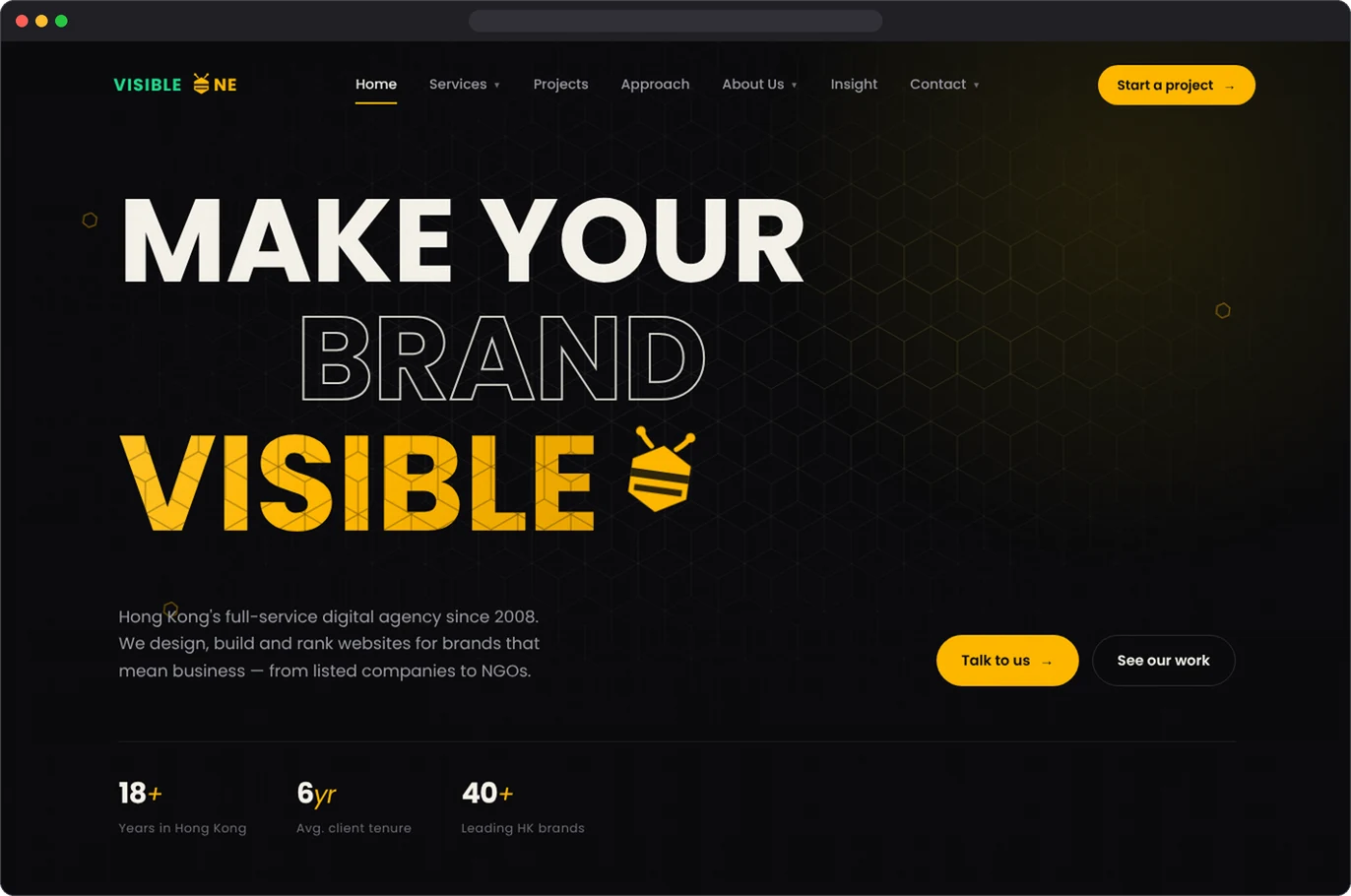
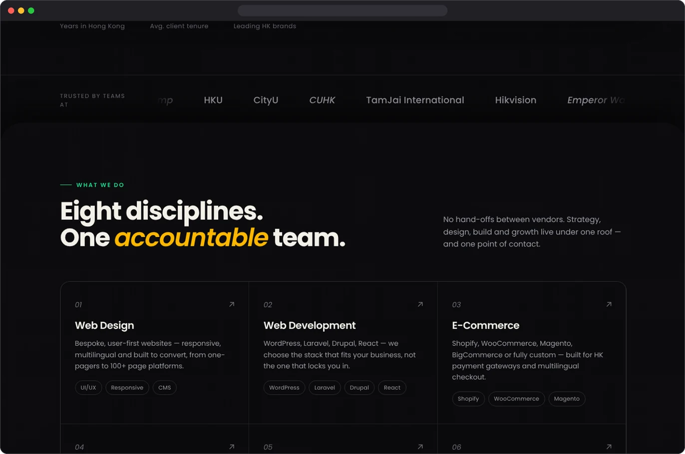
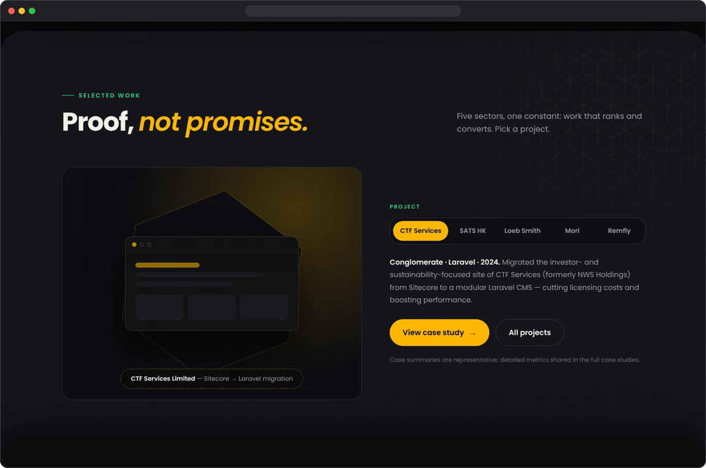
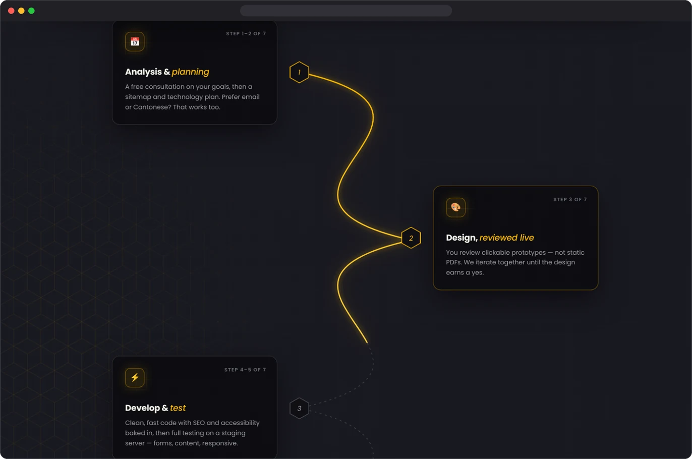
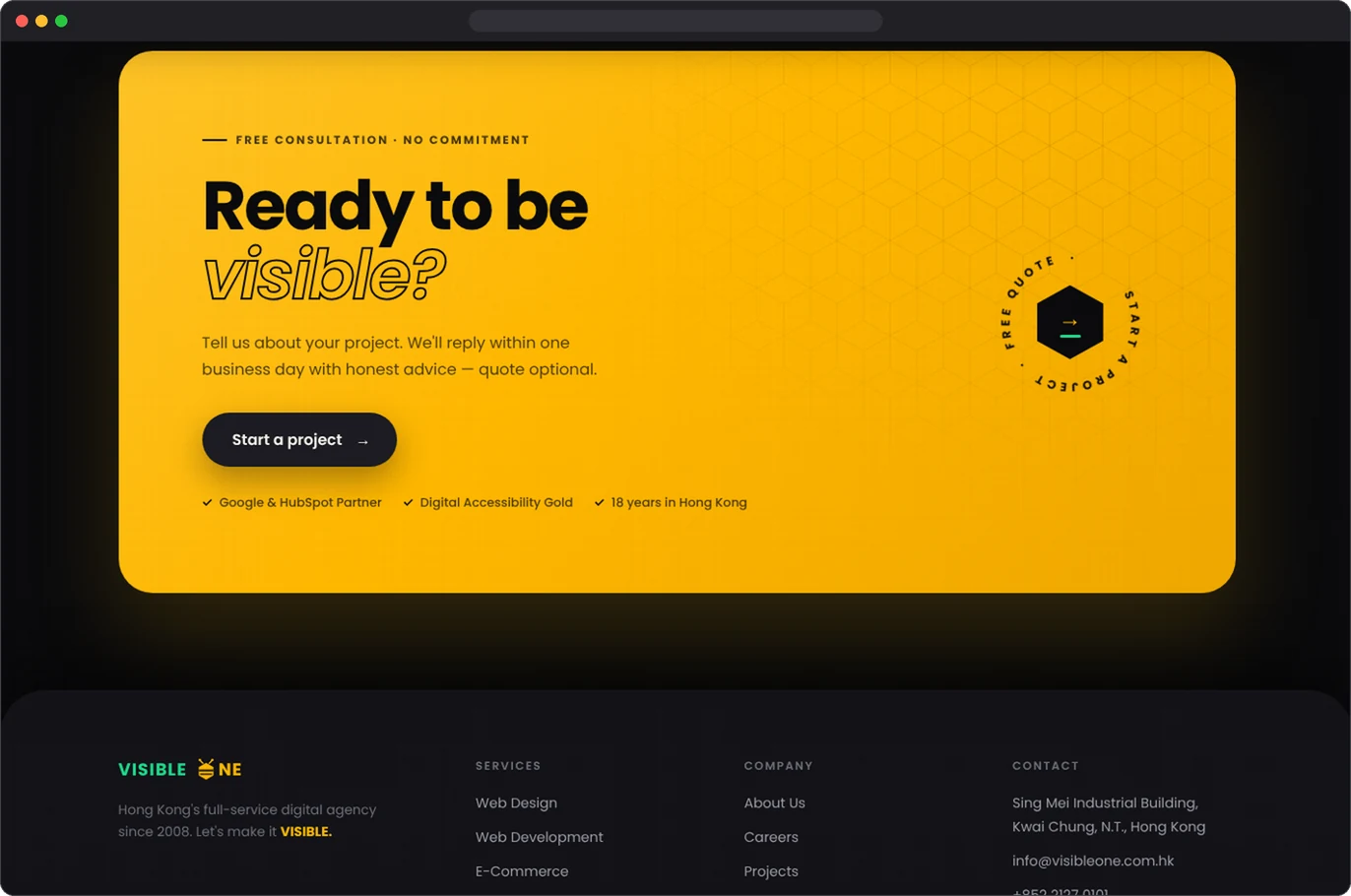
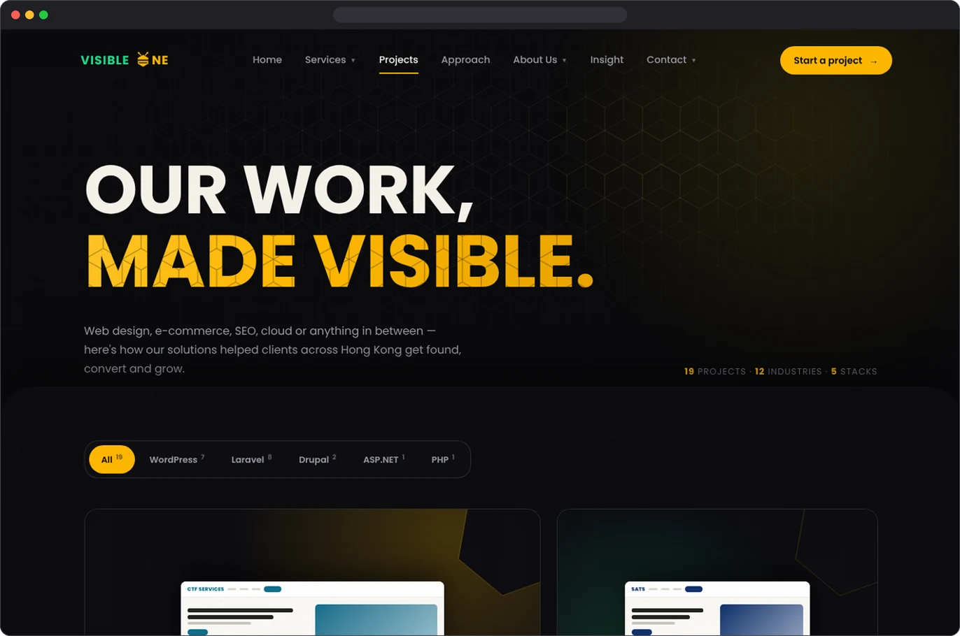
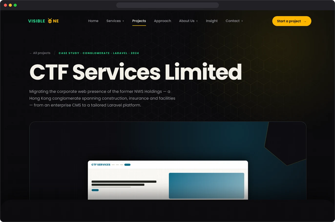
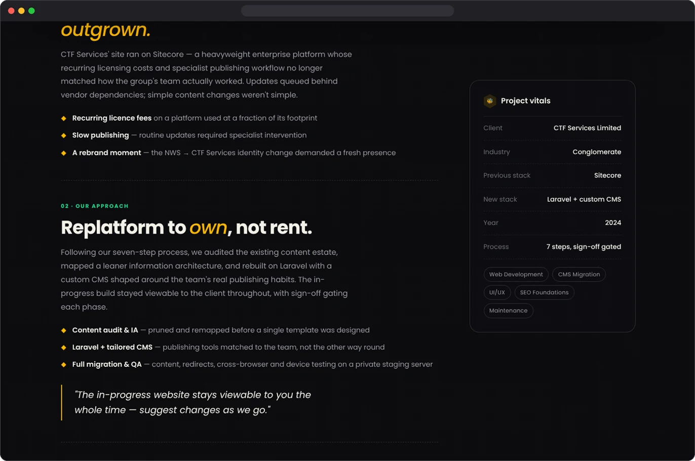
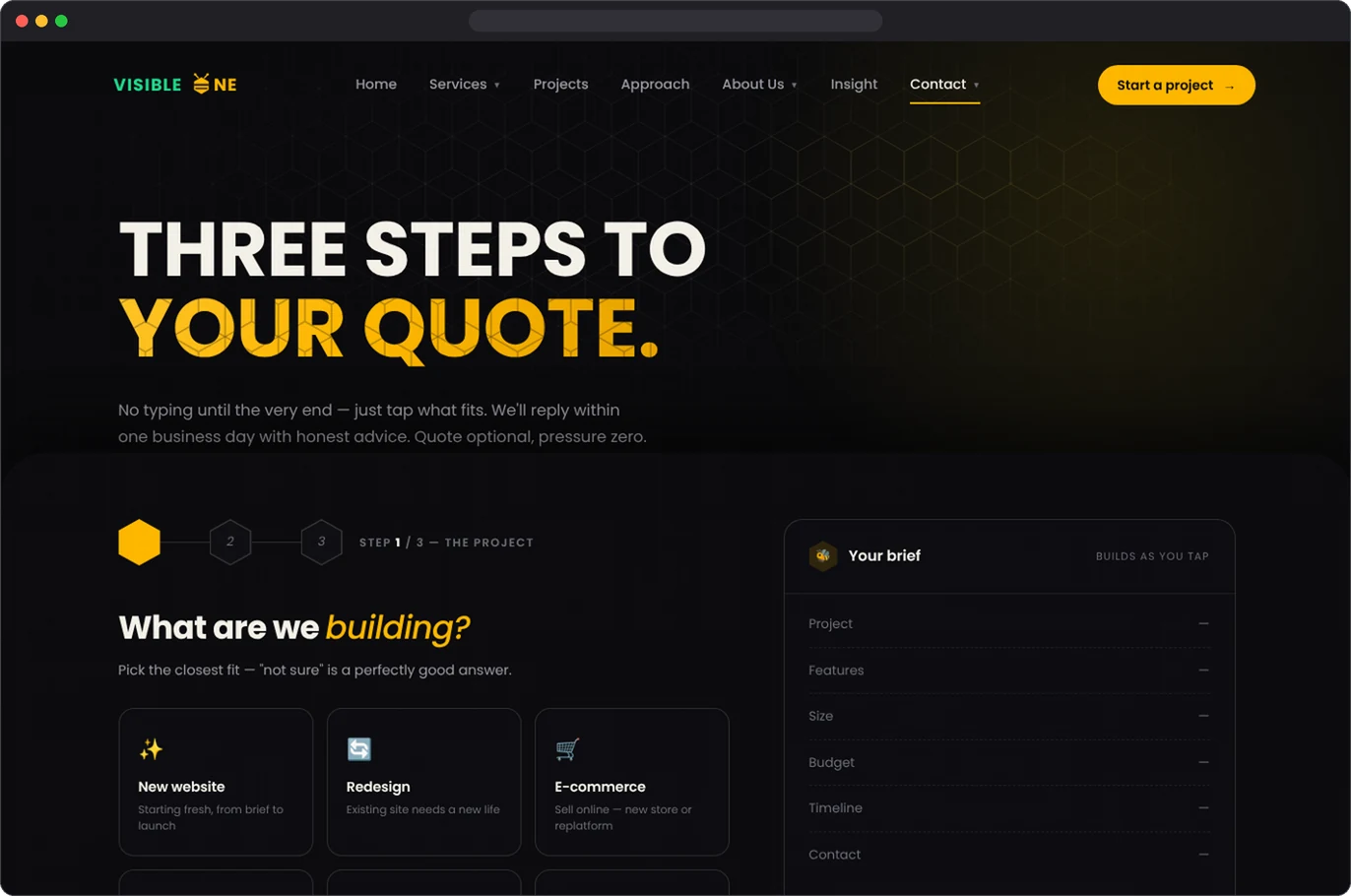
A working, responsive prototype of the full site — home, projects, case study, approach and quote pages — built without a single Figma frame. It showed me that with clear direction and strong review, AI can take a concept from idea to a live, clickable site fast — while the design judgement stays human.